Overview
Color establishes the visual tone of our products, with a palette and usage guidelines for consistency and accessibility.
| zeroheight token | Hex | Chords CSS |
|---|---|---|
| bg.default inverse | #ffffff |
var(--base-0) |
| bg.default | #090909 |
--bg-default |
| bg.level 01 | #131313 |
--bg-level-01 |
| bg.level 02 | #191919 |
--bg-level-02 |
| bg.level 03 | #232323 |
--bg-level-03 |
| bg.level 04 | #282828 |
--bg-level-04 |
| bg.level 05 | #313131 |
--bg-level-05 |
Default — --text-default
Subtle — --text-subtle
Hover — --text-hover
Pressed — --text-pressed
Disabled — --text-disabled
Strong — --text-strong
Strong on light — --text-strong-on-light
Strong on dark — --text-strong-on-dark
Alternate ADA themes may use non-blue primaries; Chords default stays WMG blue per tokens.
Usage
Color establishes the visual tone of our products, with a palette and usage guidelines for
consistency and accessibility. These pages document the WMG Chords dark UI
implementation in /tokens/wmg-chords.css. Full palette, light mode, ADA tokens, and
JSON exports:
Color · WMG Chords (zeroheight).
Code
Import /tokens/wmg-chords.css and use the semantic CSS variables shown in the Overview. This repo’s dashboard/design-system.css documents patterns alongside tokens.
HTML
Static markup matching the Overview demo. Adjust copy, labels, and ARIA attributes for your product context.
<div class="demo-panel">
<div class="demo-label">About tokens</div>
<p class="foundation-typography-meta" style="margin: 0">
We use tokens to manage color, sizing, and spacing across the system. In Figma, switch variable
modes (ADA vs WMG) from the design panel; in code, prefer semantic tokens
(<code>--bg-level-*</code>, <code>--text-*</code>, <code>--primary-*</code>) over raw hex values.
</p>
</div>
<div class="demo-panel" style="margin-top: var(--space-lg)">
<div class="demo-label">Base neutrals</div>
<p class="foundation-typography-meta" style="margin-bottom: var(--space-md)">
Global neutrals for backgrounds, typography, icons, and borders (same scale in ADA and WMG
applications).
</p>
<div class="foundation-swatch-grid">
<div class="foundation-swatch"><div class="foundation-swatch__chip" style="background: var(--base-0)"></div><div class="foundation-swatch__meta">--base-0<br /><code>#ffffff</code></div></div>
<div class="foundation-swatch"><div class="foundation-swatch__chip" style="background: var(--base-50)"></div><div class="foundation-swatch__meta">--base-50<br /><code>#fafafa</code></div></div>
<div class="foundation-swatch"><div class="foundation-swatch__chip" style="background: var(--base-100)"></div><div class="foundation-swatch__meta">--base-100<br /><code>#f0f0f0</code></div></div>
<div class="foundation-swatch"><div class="foundation-swatch__chip" style="background: var(--base-150)"></div><div class="foundation-swatch__meta">--base-150<br /><code>#e6e6e6</code></div></div>
<div class="foundation-swatch"><div class="foundation-swatch__chip" style="background: var(--base-200)"></div><div class="foundation-swatch__meta">--base-200<br /><code>#dbdbdb</code></div></div>
<div class="foundation-swatch"><div class="foundation-swatch__chip" style="background: var(--base-250)"></div><div class="foundation-swatch__meta">--base-250<br /><code>#d1d1d1</code></div></div>
<div class="foundation-swatch"><div class="foundation-swatch__chip" style="background: var(--base-300)"></div><div class="foundation-swatch__meta">--base-300<br /><code>#878787</code></div></div>
<div class="foundation-swatch"><div class="foundation-swatch__chip" style="background: var(--base-350)"></div><div class="foundation-swatch__meta">--base-350<br /><code>#666666</code></div></div>
<div class="foundation-swatch"><div class="foundation-swatch__chip" style="background: var(--base-400)"></div><div class="foundation-swatch__meta">--base-400<br /><code>#575757</code></div></div>
<div class="foundation-swatch"><div class="foundation-swatch__chip" style="background: var(--base-450)"></div><div class="foundation-swatch__meta">--base-450<br /><code>#3d3d3d</code></div></div>
<div class="foundation-swatch"><div class="foundation-swatch__chip" style="background: var(--base-500)"></div><div class="foundation-swatch__meta">--base-500<br /><code>#313131</code></div></div>
<div class="foundation-swatch"><div class="foundation-swatch__chip" style="background: var(--base-550)"></div><div class="foundation-swatch__meta">--base-550<br /><code>#282828</code></div></div>
<div class="foundation-swatch"><div class="foundation-swatch__chip" style="background: var(--base-600)"></div><div class="foundation-swatch__meta">--base-600<br /><code>#232323</code></div></div>
<div class="foundation-swatch"><div class="foundation-swatch__chip" style="background: var(--base-650)"></div><div class="foundation-swatch__meta">--base-650<br /><code>#191919</code></div></div>
<div class="foundation-swatch"><div class="foundation-swatch__chip" style="background: var(--base-700)"></div><div class="foundation-swatch__meta">--base-700<br /><code>#131313</code></div></div>
<div class="foundation-swatch"><div class="foundation-swatch__chip" style="background: var(--base-750)"></div><div class="foundation-swatch__meta">--base-750<br /><code>#090909</code></div></div>
</div>
</div>
<div class="demo-panel" style="margin-top: var(--space-lg)">
<div class="demo-label">Brand — WMG blue</div>
<div class="foundation-swatch-grid">
<div class="foundation-swatch"><div class="foundation-swatch__chip" style="background: var(--wmg-blue-50)"></div><div class="foundation-swatch__meta">--wmg-blue-50<br /><code>#e9f1fe</code></div></div>
<div class="foundation-swatch"><div class="foundation-swatch__chip" style="background: var(--wmg-blue-200)"></div><div class="foundation-swatch__meta">--wmg-blue-200<br /><code>#99bdfa</code></div></div>
<div class="foundation-swatch"><div class="foundation-swatch__chip" style="background: var(--wmg-blue-300)"></div><div class="foundation-swatch__meta">--wmg-blue-300<br /><code>#6b9ff8</code></div></div>
<div class="foundation-swatch"><div class="foundation-swatch__chip" style="background: var(--wmg-blue-400)"></div><div class="foundation-swatch__meta">--wmg-blue-400<br /><code>#4e8cf7</code></div></div>
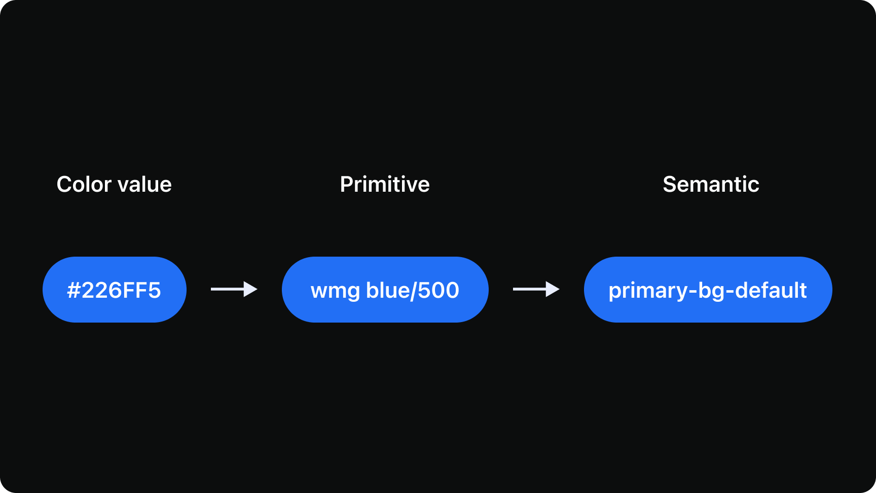
<div class="foundation-swatch"><div class="foundation-swatch__chip" style="background: var(--wmg-blue-500)"></div><div class="foundation-swatch__meta">--wmg-blue-500<br /><code>#226ff5</code></div></div>
<div class="foundation-swatch"><div class="foundation-swatch__chip" style="background: var(--wmg-blue-700)"></div><div class="foundation-swatch__meta">--wmg-blue-700<br /><code>#184fae</code></div></div>
<div class="foundation-swatch"><div class="foundation-swatch__chip" style="background: var(--wmg-blue-900)"></div><div class="foundation-swatch__meta">--wmg-blue-900<br /><code>#0e2f67</code></div></div>
</div>
</div>
<div class="demo-panel" style="margin-top: var(--space-lg)">
<div class="demo-label">Brand — WMG dark blue</div>
<div class="foundation-swatch-grid">
<div class="foundation-swatch"><div class="foundation-swatch__chip" style="background: var(--wmg-dark-blue-200)"></div><div class="foundation-swatch__meta">--wmg-dark-blue-200<br /><code>#8aa1d3</code></div></div>
<div class="foundation-swatch"><div class="foundation-swatch__chip" style="background: var(--wmg-dark-blue-400)"></div><div class="foundation-swatch__meta">--wmg-dark-blue-400<br /><code>#335bb3</code></div></div>
<div class="foundation-swatch"><div class="foundation-swatch__chip" style="background: var(--wmg-dark-blue-500)"></div><div class="foundation-swatch__meta">--wmg-dark-blue-500<br /><code>#0032a0</code></div></div>
<div class="foundation-swatch"><div class="foundation-swatch__chip" style="background: var(--wmg-dark-blue-700)"></div><div class="foundation-swatch__meta">--wmg-dark-blue-700<br /><code>#002472</code></div></div>
</div>
</div>
<div class="demo-panel" style="margin-top: var(--space-lg)">
<div class="demo-label">Brand — WMG yellow</div>
<div class="foundation-swatch-grid">
<div class="foundation-swatch"><div class="foundation-swatch__chip" style="background: var(--wmg-yellow-200)"></div><div class="foundation-swatch__meta">--wmg-yellow-200<br /><code>#f7ffa9</code></div></div>
<div class="foundation-swatch"><div class="foundation-swatch__chip" style="background: var(--wmg-yellow-400)"></div><div class="foundation-swatch__meta">--wmg-yellow-400<br /><code>#f1ff69</code></div></div>
<div class="foundation-swatch"><div class="foundation-swatch__chip" style="background: var(--wmg-yellow-500)"></div><div class="foundation-swatch__meta">--wmg-yellow-500<br /><code>#edff43</code></div></div>
<div class="foundation-swatch"><div class="foundation-swatch__chip" style="background: var(--wmg-yellow-700)"></div><div class="foundation-swatch__meta">--wmg-yellow-700<br /><code>#a8b530</code></div></div>
</div>
</div>
<div class="demo-panel" style="margin-top: var(--space-lg)">
<div class="demo-label">Semantic — backgrounds (dark mode)</div>
<p class="foundation-typography-meta" style="margin-bottom: var(--space-md)">
Elevation in dark UI is expressed by layering <code>bg.level</code> steps (see
<a class="text-link" href="/dashboard/design-system/foundation-elevation.html">Elevation</a>). Chords
CSS uses hyphenated names below.
</p>
<div class="table-scroll">
<table class="ds-table">
<thead>
<tr>
<th>zeroheight token</th>
<th>Hex</th>
<th>Chords CSS</th>
</tr>
</thead>
<tbody>
<tr>
<td>bg.default inverse</td>
<td><code>#ffffff</code></td>
<td><code>var(--base-0)</code></td>
</tr>
<tr>
<td>bg.default</td>
<td><code>#090909</code></td>
<td><code>--bg-default</code></td>
</tr>
<tr>
<td>bg.level 01</td>
<td><code>#131313</code></td>
<td><code>--bg-level-01</code></td>
</tr>
<tr>
<td>bg.level 02</td>
<td><code>#191919</code></td>
<td><code>--bg-level-02</code></td>
</tr>
<tr>
<td>bg.level 03</td>
<td><code>#232323</code></td>
<td><code>--bg-level-03</code></td>
</tr>
<tr>
<td>bg.level 04</td>
<td><code>#282828</code></td>
<td><code>--bg-level-04</code></td>
</tr>
<tr>
<td>bg.level 05</td>
<td><code>#313131</code></td>
<td><code>--bg-level-05</code></td>
</tr>
</tbody>
</table>
</div>
<div class="foundation-swatch-grid" style="margin-top: var(--space-md)">
<div class="foundation-swatch"><div class="foundation-swatch__chip" style="background: var(--bg-default)"></div><div class="foundation-swatch__meta">--bg-default</div></div>
<div class="foundation-swatch"><div class="foundation-swatch__chip" style="background: var(--bg-level-01)"></div><div class="foundation-swatch__meta">--bg-level-01</div></div>
<div class="foundation-swatch"><div class="foundation-swatch__chip" style="background: var(--bg-level-02)"></div><div class="foundation-swatch__meta">--bg-level-02</div></div>
<div class="foundation-swatch"><div class="foundation-swatch__chip" style="background: var(--bg-level-03)"></div><div class="foundation-swatch__meta">--bg-level-03</div></div>
<div class="foundation-swatch"><div class="foundation-swatch__chip" style="background: var(--bg-level-04)"></div><div class="foundation-swatch__meta">--bg-level-04</div></div>
<div class="foundation-swatch"><div class="foundation-swatch__chip" style="background: var(--bg-level-05)"></div><div class="foundation-swatch__meta">--bg-level-05</div></div>
</div>
</div>
<div class="demo-panel" style="margin-top: var(--space-lg)">
<div class="demo-label">Semantic — alpha surfaces</div>
<div class="foundation-swatch-grid">
<div class="foundation-swatch"><div class="foundation-swatch__chip" style="background: var(--alpha-bg-default)"></div><div class="foundation-swatch__meta">--alpha-bg-default<br /><code>rgba(255,255,255,0.06)</code></div></div>
<div class="foundation-swatch"><div class="foundation-swatch__chip" style="background: var(--alpha-bg-strong)"></div><div class="foundation-swatch__meta">--alpha-bg-strong<br /><code>rgba(255,255,255,0.12)</code></div></div>
</div>
</div>
<div class="demo-panel" style="margin-top: var(--space-lg)">
<div class="demo-label">Semantic — text</div>
<div class="demo-row" style="flex-direction: column; align-items: flex-start; gap: var(--space-sm)">
<p style="margin: 0; color: var(--text-default)">Default — <code>--text-default</code></p>
<p style="margin: 0; color: var(--text-subtle)">Subtle — <code>--text-subtle</code></p>
<p style="margin: 0; color: var(--text-hover)">Hover — <code>--text-hover</code></p>
<p style="margin: 0; color: var(--text-pressed)">Pressed — <code>--text-pressed</code></p>
<p style="margin: 0; color: var(--text-disabled)">Disabled — <code>--text-disabled</code></p>
<p style="margin: 0; color: var(--text-strong)">Strong — <code>--text-strong</code></p>
<p style="margin: 0; color: var(--text-strong-on-light); background: var(--base-0); padding: 2px 6px; border-radius: var(--radius-xs)">Strong on light — <code>--text-strong-on-light</code></p>
<p style="margin: 0; color: var(--text-strong-on-dark); background: var(--base-700); padding: 2px 6px; border-radius: var(--radius-xs)">Strong on dark — <code>--text-strong-on-dark</code></p>
</div>
</div>
<div class="demo-panel" style="margin-top: var(--space-lg)">
<div class="demo-label">Primary interactive</div>
<div class="foundation-swatch-grid">
<div class="foundation-swatch"><div class="foundation-swatch__chip" style="background: var(--primary-default)"></div><div class="foundation-swatch__meta">--primary-default</div></div>
<div class="foundation-swatch"><div class="foundation-swatch__chip" style="background: var(--primary-hover)"></div><div class="foundation-swatch__meta">--primary-hover</div></div>
<div class="foundation-swatch"><div class="foundation-swatch__chip" style="background: var(--primary-pressed)"></div><div class="foundation-swatch__meta">--primary-pressed</div></div>
<div class="foundation-swatch"><div class="foundation-swatch__chip" style="background: var(--primary-disabled-bg)"></div><div class="foundation-swatch__meta">--primary-disabled-bg</div></div>
</div>
<p style="margin: var(--space-md) 0 0; font-size: var(--fs-caption); color: var(--text-subtle)">
Alternate ADA themes may use non-blue primaries; Chords default stays WMG blue per tokens.
</p>
</div>
<div class="demo-panel" style="margin-top: var(--space-lg)">
<div class="demo-label">Secondary button</div>
<div class="foundation-swatch-grid">
<div class="foundation-swatch"><div class="foundation-swatch__chip" style="background: var(--secondary-border)"></div><div class="foundation-swatch__meta">--secondary-border</div></div>
<div class="foundation-swatch"><div class="foundation-swatch__chip" style="background: var(--secondary-hover-bg)"></div><div class="foundation-swatch__meta">--secondary-hover-bg</div></div>
<div class="foundation-swatch"><div class="foundation-swatch__chip" style="background: var(--secondary-pressed-bg)"></div><div class="foundation-swatch__meta">--secondary-pressed-bg</div></div>
<div class="foundation-swatch"><div class="foundation-swatch__chip" style="background: transparent; border: 2px dashed var(--secondary-disabled-border)"></div><div class="foundation-swatch__meta">--secondary-disabled-border<br /><code>rgba(255,255,255,0.35)</code></div></div>
</div>
</div>
<div class="demo-panel" style="margin-top: var(--space-lg)">
<div class="demo-label">Focus & links</div>
<div class="foundation-swatch-grid">
<div class="foundation-swatch"><div class="foundation-swatch__chip" style="background: var(--focus-ring)"></div><div class="foundation-swatch__meta">--focus-ring<br /><code>#5bc5f8</code></div></div>
<div class="foundation-swatch"><div class="foundation-swatch__chip" style="background: var(--interactive-blue)"></div><div class="foundation-swatch__meta">--interactive-blue</div></div>
</div>
</div>
<div class="demo-panel" style="margin-top: var(--space-lg)">
<div class="demo-label">Fields & borders</div>
<div class="foundation-swatch-grid">
<div class="foundation-swatch"><div class="foundation-swatch__chip" style="background: var(--field-bg-default)"></div><div class="foundation-swatch__meta">--field-bg-default</div></div>
<div class="foundation-swatch"><div class="foundation-swatch__chip" style="background: var(--field-bg-hover)"></div><div class="foundation-swatch__meta">--field-bg-hover</div></div>
<div class="foundation-swatch"><div class="foundation-swatch__chip" style="background: transparent; box-shadow: inset 0 0 0 2px var(--field-border-subtle)"></div><div class="foundation-swatch__meta">--field-border-subtle</div></div>
<div class="foundation-swatch"><div class="foundation-swatch__chip" style="background: transparent; box-shadow: inset 0 0 0 2px var(--border-strong-emphasis)"></div><div class="foundation-swatch__meta">--border-strong-emphasis</div></div>
</div>
</div>
<div class="demo-panel" style="margin-top: var(--space-lg)">
<div class="demo-label">System</div>
<div class="foundation-swatch-grid">
<div class="foundation-swatch"><div class="foundation-swatch__chip" style="background: var(--sys-success)"></div><div class="foundation-swatch__meta">--sys-success<br /><code>#4de885</code></div></div>
<div class="foundation-swatch"><div class="foundation-swatch__chip" style="background: var(--sys-success-deep)"></div><div class="foundation-swatch__meta">--sys-success-deep<br /><code>#00813d</code></div></div>
<div class="foundation-swatch"><div class="foundation-swatch__chip" style="background: var(--sys-error)"></div><div class="foundation-swatch__meta">--sys-error<br /><code>#ff8c8c</code></div></div>
<div class="foundation-swatch"><div class="foundation-swatch__chip" style="background: var(--sys-error-deep)"></div><div class="foundation-swatch__meta">--sys-error-deep<br /><code>#d42b3a</code></div></div>
<div class="foundation-swatch"><div class="foundation-swatch__chip" style="background: var(--sys-warning)"></div><div class="foundation-swatch__meta">--sys-warning<br /><code>#ffb800</code></div></div>
<div class="foundation-swatch"><div class="foundation-swatch__chip" style="background: var(--sys-info)"></div><div class="foundation-swatch__meta">--sys-info<br /><code>#2556ea</code></div></div>
<div class="foundation-swatch"><div class="foundation-swatch__chip" style="background: var(--sys-info-muted)"></div><div class="foundation-swatch__meta">--sys-info-muted<br /><code>#9bb1f5</code></div></div>
<div class="foundation-swatch"><div class="foundation-swatch__chip" style="background: var(--sys-info-foreground)"></div><div class="foundation-swatch__meta">--sys-info-foreground<br /><code>#6d8ef1</code></div></div>
</div>
</div>
<div class="demo-panel" style="margin-top: var(--space-lg)">
<div class="demo-label">Status surfaces (badges, chips)</div>
<div class="foundation-swatch-grid">
<div class="foundation-swatch"><div class="foundation-swatch__chip" style="background: var(--surface-success-muted)"></div><div class="foundation-swatch__meta">--surface-success-muted</div></div>
<div class="foundation-swatch"><div class="foundation-swatch__chip" style="background: var(--surface-success-soft)"></div><div class="foundation-swatch__meta">--surface-success-soft</div></div>
<div class="foundation-swatch"><div class="foundation-swatch__chip" style="background: var(--surface-warning-muted)"></div><div class="foundation-swatch__meta">--surface-warning-muted</div></div>
</div>
</div>React (TypeScript)
Use the same structure as the HTML block with className instead of class. Keep token/CSS imports in your app shell.
import type { ReactNode } from "react";

/** Mirror the HTML demo: replace class=> className, self-close void elements, keep WMG Chords global CSS loaded. */
export function FoundationColorExample(): ReactNode {
  return (
    <>
      {/* TODO: paste JSX equivalent of the HTML tab */}
    </>
  );
}
Markdown (AI & docs)
Single bundle for Cursor, ChatGPT, or Confluence: rules plus a fenced HTML block you can extend.
# WMG Chords — Color
Use with AI tools or internal docs. Tokens: `/tokens/wmg-chords.css`; components: `dashboard/design-system.css`.
## HTML
```html
<div class="demo-panel">
<div class="demo-label">About tokens</div>
<p class="foundation-typography-meta" style="margin: 0">
We use tokens to manage color, sizing, and spacing across the system. In Figma, switch variable
modes (ADA vs WMG) from the design panel; in code, prefer semantic tokens
(<code>--bg-level-*</code>, <code>--text-*</code>, <code>--primary-*</code>) over raw hex values.
</p>
</div>
<div class="demo-panel" style="margin-top: var(--space-lg)">
<div class="demo-label">Base neutrals</div>
<p class="foundation-typography-meta" style="margin-bottom: var(--space-md)">
Global neutrals for backgrounds, typography, icons, and borders (same scale in ADA and WMG
applications).
</p>
<div class="foundation-swatch-grid">
<div class="foundation-swatch"><div class="foundation-swatch__chip" style="background: var(--base-0)"></div><div class="foundation-swatch__meta">--base-0<br /><code>#ffffff</code></div></div>
<div class="foundation-swatch"><div class="foundation-swatch__chip" style="background: var(--base-50)"></div><div class="foundation-swatch__meta">--base-50<br /><code>#fafafa</code></div></div>
<div class="foundation-swatch"><div class="foundation-swatch__chip" style="background: var(--base-100)"></div><div class="foundation-swatch__meta">--base-100<br /><code>#f0f0f0</code></div></div>
<div class="foundation-swatch"><div class="foundation-swatch__chip" style="background: var(--base-150)"></div><div class="foundation-swatch__meta">--base-150<br /><code>#e6e6e6</code></div></div>
<div class="foundation-swatch"><div class="foundation-swatch__chip" style="background: var(--base-200)"></div><div class="foundation-swatch__meta">--base-200<br /><code>#dbdbdb</code></div></div>
<div class="foundation-swatch"><div class="foundation-swatch__chip" style="background: var(--base-250)"></div><div class="foundation-swatch__meta">--base-250<br /><code>#d1d1d1</code></div></div>
<div class="foundation-swatch"><div class="foundation-swatch__chip" style="background: var(--base-300)"></div><div class="foundation-swatch__meta">--base-300<br /><code>#878787</code></div></div>
<div class="foundation-swatch"><div class="foundation-swatch__chip" style="background: var(--base-350)"></div><div class="foundation-swatch__meta">--base-350<br /><code>#666666</code></div></div>
<div class="foundation-swatch"><div class="foundation-swatch__chip" style="background: var(--base-400)"></div><div class="foundation-swatch__meta">--base-400<br /><code>#575757</code></div></div>
<div class="foundation-swatch"><div class="foundation-swatch__chip" style="background: var(--base-450)"></div><div class="foundation-swatch__meta">--base-450<br /><code>#3d3d3d</code></div></div>
<div class="foundation-swatch"><div class="foundation-swatch__chip" style="background: var(--base-500)"></div><div class="foundation-swatch__meta">--base-500<br /><code>#313131</code></div></div>
<div class="foundation-swatch"><div class="foundation-swatch__chip" style="background: var(--base-550)"></div><div class="foundation-swatch__meta">--base-550<br /><code>#282828</code></div></div>
<div class="foundation-swatch"><div class="foundation-swatch__chip" style="background: var(--base-600)"></div><div class="foundation-swatch__meta">--base-600<br /><code>#232323</code></div></div>
<div class="foundation-swatch"><div class="foundation-swatch__chip" style="background: var(--base-650)"></div><div class="foundation-swatch__meta">--base-650<br /><code>#191919</code></div></div>
<div class="foundation-swatch"><div class="foundation-swatch__chip" style="background: var(--base-700)"></div><div class="foundation-swatch__meta">--base-700<br /><code>#131313</code></div></div>
<div class="foundation-swatch"><div class="foundation-swatch__chip" style="background: var(--base-750)"></div><div class="foundation-swatch__meta">--base-750<br /><code>#090909</code></div></div>
</div>
</div>
<div class="demo-panel" style="margin-top: var(--space-lg)">
<div class="demo-label">Brand — WMG blue</div>
<div class="foundation-swatch-grid">
<div class="foundation-swatch"><div class="foundation-swatch__chip" style="background: var(--wmg-blue-50)"></div><div class="foundation-swatch__meta">--wmg-blue-50<br /><code>#e9f1fe</code></div></div>
<div class="foundation-swatch"><div class="foundation-swatch__chip" style="background: var(--wmg-blue-200)"></div><div class="foundation-swatch__meta">--wmg-blue-200<br /><code>#99bdfa</code></div></div>
<div class="foundation-swatch"><div class="foundation-swatch__chip" style="background: var(--wmg-blue-300)"></div><div class="foundation-swatch__meta">--wmg-blue-300<br /><code>#6b9ff8</code></div></div>
<div class="foundation-swatch"><div class="foundation-swatch__chip" style="background: var(--wmg-blue-400)"></div><div class="foundation-swatch__meta">--wmg-blue-400<br /><code>#4e8cf7</code></div></div>
<div class="foundation-swatch"><div class="foundation-swatch__chip" style="background: var(--wmg-blue-500)"></div><div class="foundation-swatch__meta">--wmg-blue-500<br /><code>#226ff5</code></div></div>
<div class="foundation-swatch"><div class="foundation-swatch__chip" style="background: var(--wmg-blue-700)"></div><div class="foundation-swatch__meta">--wmg-blue-700<br /><code>#184fae</code></div></div>
<div class="foundation-swatch"><div class="foundation-swatch__chip" style="background: var(--wmg-blue-900)"></div><div class="foundation-swatch__meta">--wmg-blue-900<br /><code>#0e2f67</code></div></div>
</div>
</div>
<div class="demo-panel" style="margin-top: var(--space-lg)">
<div class="demo-label">Brand — WMG dark blue</div>
<div class="foundation-swatch-grid">
<div class="foundation-swatch"><div class="foundation-swatch__chip" style="background: var(--wmg-dark-blue-200)"></div><div class="foundation-swatch__meta">--wmg-dark-blue-200<br /><code>#8aa1d3</code></div></div>
<div class="foundation-swatch"><div class="foundation-swatch__chip" style="background: var(--wmg-dark-blue-400)"></div><div class="foundation-swatch__meta">--wmg-dark-blue-400<br /><code>#335bb3</code></div></div>
<div class="foundation-swatch"><div class="foundation-swatch__chip" style="background: var(--wmg-dark-blue-500)"></div><div class="foundation-swatch__meta">--wmg-dark-blue-500<br /><code>#0032a0</code></div></div>
<div class="foundation-swatch"><div class="foundation-swatch__chip" style="background: var(--wmg-dark-blue-700)"></div><div class="foundation-swatch__meta">--wmg-dark-blue-700<br /><code>#002472</code></div></div>
</div>
</div>
<div class="demo-panel" style="margin-top: var(--space-lg)">
<div class="demo-label">Brand — WMG yellow</div>
<div class="foundation-swatch-grid">
<div class="foundation-swatch"><div class="foundation-swatch__chip" style="background: var(--wmg-yellow-200)"></div><div class="foundation-swatch__meta">--wmg-yellow-200<br /><code>#f7ffa9</code></div></div>
<div class="foundation-swatch"><div class="foundation-swatch__chip" style="background: var(--wmg-yellow-400)"></div><div class="foundation-swatch__meta">--wmg-yellow-400<br /><code>#f1ff69</code></div></div>
<div class="foundation-swatch"><div class="foundation-swatch__chip" style="background: var(--wmg-yellow-500)"></div><div class="foundation-swatch__meta">--wmg-yellow-500<br /><code>#edff43</code></div></div>
<div class="foundation-swatch"><div class="foundation-swatch__chip" style="background: var(--wmg-yellow-700)"></div><div class="foundation-swatch__meta">--wmg-yellow-700<br /><code>#a8b530</code></div></div>
</div>
</div>
<div class="demo-panel" style="margin-top: var(--space-lg)">
<div class="demo-label">Semantic — backgrounds (dark mode)</div>
<p class="foundation-typography-meta" style="margin-bottom: var(--space-md)">
Elevation in dark UI is expressed by layering <code>bg.level</code> steps (see
<a class="text-link" href="/dashboard/design-system/foundation-elevation.html">Elevation</a>). Chords
CSS uses hyphenated names below.
</p>
<div class="table-scroll">
<table class="ds-table">
<thead>
<tr>
<th>zeroheight token</th>
<th>Hex</th>
<th>Chords CSS</th>
</tr>
</thead>
<tbody>
<tr>
<td>bg.default inverse</td>
<td><code>#ffffff</code></td>
<td><code>var(--base-0)</code></td>
</tr>
<tr>
<td>bg.default</td>
<td><code>#090909</code></td>
<td><code>--bg-default</code></td>
</tr>
<tr>
<td>bg.level 01</td>
<td><code>#131313</code></td>
<td><code>--bg-level-01</code></td>
</tr>
<tr>
<td>bg.level 02</td>
<td><code>#191919</code></td>
<td><code>--bg-level-02</code></td>
</tr>
<tr>
<td>bg.level 03</td>
<td><code>#232323</code></td>
<td><code>--bg-level-03</code></td>
</tr>
<tr>
<td>bg.level 04</td>
<td><code>#282828</code></td>
<td><code>--bg-level-04</code></td>
</tr>
<tr>
<td>bg.level 05</td>
<td><code>#313131</code></td>
<td><code>--bg-level-05</code></td>
</tr>
</tbody>
</table>
</div>
<div class="foundation-swatch-grid" style="margin-top: var(--space-md)">
<div class="foundation-swatch"><div class="foundation-swatch__chip" style="background: var(--bg-default)"></div><div class="foundation-swatch__meta">--bg-default</div></div>
<div class="foundation-swatch"><div class="foundation-swatch__chip" style="background: var(--bg-level-01)"></div><div class="foundation-swatch__meta">--bg-level-01</div></div>
<div class="foundation-swatch"><div class="foundation-swatch__chip" style="background: var(--bg-level-02)"></div><div class="foundation-swatch__meta">--bg-level-02</div></div>
<div class="foundation-swatch"><div class="foundation-swatch__chip" style="background: var(--bg-level-03)"></div><div class="foundation-swatch__meta">--bg-level-03</div></div>
<div class="foundation-swatch"><div class="foundation-swatch__chip" style="background: var(--bg-level-04)"></div><div class="foundation-swatch__meta">--bg-level-04</div></div>
<div class="foundation-swatch"><div class="foundation-swatch__chip" style="background: var(--bg-level-05)"></div><div class="foundation-swatch__meta">--bg-level-05</div></div>
</div>
</div>
<div class="demo-panel" style="margin-top: var(--space-lg)">
<div class="demo-label">Semantic — alpha surfaces</div>
<div class="foundation-swatch-grid">
<div class="foundation-swatch"><div class="foundation-swatch__chip" style="background: var(--alpha-bg-default)"></div><div class="foundation-swatch__meta">--alpha-bg-default<br /><code>rgba(255,255,255,0.06)</code></div></div>
<div class="foundation-swatch"><div class="foundation-swatch__chip" style="background: var(--alpha-bg-strong)"></div><div class="foundation-swatch__meta">--alpha-bg-strong<br /><code>rgba(255,255,255,0.12)</code></div></div>
</div>
</div>
<div class="demo-panel" style="margin-top: var(--space-lg)">
<div class="demo-label">Semantic — text</div>
<div class="demo-row" style="flex-direction: column; align-items: flex-start; gap: var(--space-sm)">
<p style="margin: 0; color: var(--text-default)">Default — <code>--text-default</code></p>
<p style="margin: 0; color: var(--text-subtle)">Subtle — <code>--text-subtle</code></p>
<p style="margin: 0; color: var(--text-hover)">Hover — <code>--text-hover</code></p>
<p style="margin: 0; color: var(--text-pressed)">Pressed — <code>--text-pressed</code></p>
<p style="margin: 0; color: var(--text-disabled)">Disabled — <code>--text-disabled</code></p>
<p style="margin: 0; color: var(--text-strong)">Strong — <code>--text-strong</code></p>
<p style="margin: 0; color: var(--text-strong-on-light); background: var(--base-0); padding: 2px 6px; border-radius: var(--radius-xs)">Strong on light — <code>--text-strong-on-light</code></p>
<p style="margin: 0; color: var(--text-strong-on-dark); background: var(--base-700); padding: 2px 6px; border-radius: var(--radius-xs)">Strong on dark — <code>--text-strong-on-dark</code></p>
</div>
</div>
<div class="demo-panel" style="margin-top: var(--space-lg)">
<div class="demo-label">Primary interactive</div>
<div class="foundation-swatch-grid">
<div class="foundation-swatch"><div class="foundation-swatch__chip" style="background: var(--primary-default)"></div><div class="foundation-swatch__meta">--primary-default</div></div>
<div class="foundation-swatch"><div class="foundation-swatch__chip" style="background: var(--primary-hover)"></div><div class="foundation-swatch__meta">--primary-hover</div></div>
<div class="foundation-swatch"><div class="foundation-swatch__chip" style="background: var(--primary-pressed)"></div><div class="foundation-swatch__meta">--primary-pressed</div></div>
<div class="foundation-swatch"><div class="foundation-swatch__chip" style="background: var(--primary-disabled-bg)"></div><div class="foundation-swatch__meta">--primary-disabled-bg</div></div>
</div>
<p style="margin: var(--space-md) 0 0; font-size: var(--fs-caption); color: var(--text-subtle)">
Alternate ADA themes may use non-blue primaries; Chords default stays WMG blue per tokens.
</p>
</div>
<div class="demo-panel" style="margin-top: var(--space-lg)">
<div class="demo-label">Secondary button</div>
<div class="foundation-swatch-grid">
<div class="foundation-swatch"><div class="foundation-swatch__chip" style="background: var(--secondary-border)"></div><div class="foundation-swatch__meta">--secondary-border</div></div>
<div class="foundation-swatch"><div class="foundation-swatch__chip" style="background: var(--secondary-hover-bg)"></div><div class="foundation-swatch__meta">--secondary-hover-bg</div></div>
<div class="foundation-swatch"><div class="foundation-swatch__chip" style="background: var(--secondary-pressed-bg)"></div><div class="foundation-swatch__meta">--secondary-pressed-bg</div></div>
<div class="foundation-swatch"><div class="foundation-swatch__chip" style="background: transparent; border: 2px dashed var(--secondary-disabled-border)"></div><div class="foundation-swatch__meta">--secondary-disabled-border<br /><code>rgba(255,255,255,0.35)</code></div></div>
</div>
</div>
<div class="demo-panel" style="margin-top: var(--space-lg)">
<div class="demo-label">Focus & links</div>
<div class="foundation-swatch-grid">
<div class="foundation-swatch"><div class="foundation-swatch__chip" style="background: var(--focus-ring)"></div><div class="foundation-swatch__meta">--focus-ring<br /><code>#5bc5f8</code></div></div>
<div class="foundation-swatch"><div class="foundation-swatch__chip" style="background: var(--interactive-blue)"></div><div class="foundation-swatch__meta">--interactive-blue</div></div>
</div>
</div>
<div class="demo-panel" style="margin-top: var(--space-lg)">
<div class="demo-label">Fields & borders</div>
<div class="foundation-swatch-grid">
<div class="foundation-swatch"><div class="foundation-swatch__chip" style="background: var(--field-bg-default)"></div><div class="foundation-swatch__meta">--field-bg-default</div></div>
<div class="foundation-swatch"><div class="foundation-swatch__chip" style="background: var(--field-bg-hover)"></div><div class="foundation-swatch__meta">--field-bg-hover</div></div>
<div class="foundation-swatch"><div class="foundation-swatch__chip" style="background: transparent; box-shadow: inset 0 0 0 2px var(--field-border-subtle)"></div><div class="foundation-swatch__meta">--field-border-subtle</div></div>
<div class="foundation-swatch"><div class="foundation-swatch__chip" style="background: transparent; box-shadow: inset 0 0 0 2px var(--border-strong-emphasis)"></div><div class="foundation-swatch__meta">--border-strong-emphasis</div></div>
</div>
</div>
<div class="demo-panel" style="margin-top: var(--space-lg)">
<div class="demo-label">System</div>
<div class="foundation-swatch-grid">
<div class="foundation-swatch"><div class="foundation-swatch__chip" style="background: var(--sys-success)"></div><div class="foundation-swatch__meta">--sys-success<br /><code>#4de885</code></div></div>
<div class="foundation-swatch"><div class="foundation-swatch__chip" style="background: var(--sys-success-deep)"></div><div class="foundation-swatch__meta">--sys-success-deep<br /><code>#00813d</code></div></div>
<div class="foundation-swatch"><div class="foundation-swatch__chip" style="background: var(--sys-error)"></div><div class="foundation-swatch__meta">--sys-error<br /><code>#ff8c8c</code></div></div>
<div class="foundation-swatch"><div class="foundation-swatch__chip" style="background: var(--sys-error-deep)"></div><div class="foundation-swatch__meta">--sys-error-deep<br /><code>#d42b3a</code></div></div>
<div class="foundation-swatch"><div class="foundation-swatch__chip" style="background: var(--sys-warning)"></div><div class="foundation-swatch__meta">--sys-warning<br /><code>#ffb800</code></div></div>
<div class="foundation-swatch"><div class="foundation-swatch__chip" style="background: var(--sys-info)"></div><div class="foundation-swatch__meta">--sys-info<br /><code>#2556ea</code></div></div>
<div class="foundation-swatch"><div class="foundation-swatch__chip" style="background: var(--sys-info-muted)"></div><div class="foundation-swatch__meta">--sys-info-muted<br /><code>#9bb1f5</code></div></div>
<div class="foundation-swatch"><div class="foundation-swatch__chip" style="background: var(--sys-info-foreground)"></div><div class="foundation-swatch__meta">--sys-info-foreground<br /><code>#6d8ef1</code></div></div>
</div>
</div>
<div class="demo-panel" style="margin-top: var(--space-lg)">
<div class="demo-label">Status surfaces (badges, chips)</div>
<div class="foundation-swatch-grid">
<div class="foundation-swatch"><div class="foundation-swatch__chip" style="background: var(--surface-success-muted)"></div><div class="foundation-swatch__meta">--surface-success-muted</div></div>
<div class="foundation-swatch"><div class="foundation-swatch__chip" style="background: var(--surface-success-soft)"></div><div class="foundation-swatch__meta">--surface-success-soft</div></div>
<div class="foundation-swatch"><div class="foundation-swatch__chip" style="background: var(--surface-warning-muted)"></div><div class="foundation-swatch__meta">--surface-warning-muted</div></div>
</div>
</div>
```