Overview
Elevation is the distance between two surfaces on the z-axis — how stacked elements read as closer or farther from the viewer.
--sidebar-nav-item-shadow
0 4px 12px rgba(0, 0, 0, 0.15)
Usage
Elevation is the distance between two surfaces on the z-axis — how stacked elements read as
closer or farther from the viewer. Background tokens and shadows in
/tokens/wmg-chords.css support this. Full documentation:
Elevation · WMG Chords (zeroheight).
Code
Import /tokens/wmg-chords.css and use the semantic CSS variables shown in the Overview. This repo’s dashboard/design-system.css documents patterns alongside tokens.
HTML
Static markup matching the Overview demo. Adjust copy, labels, and ARIA attributes for your product context.
<div class="demo-panel">
<div class="demo-label">Z-axis and dark mode</div>
<p class="foundation-typography-meta" style="margin-bottom: var(--space-md)">
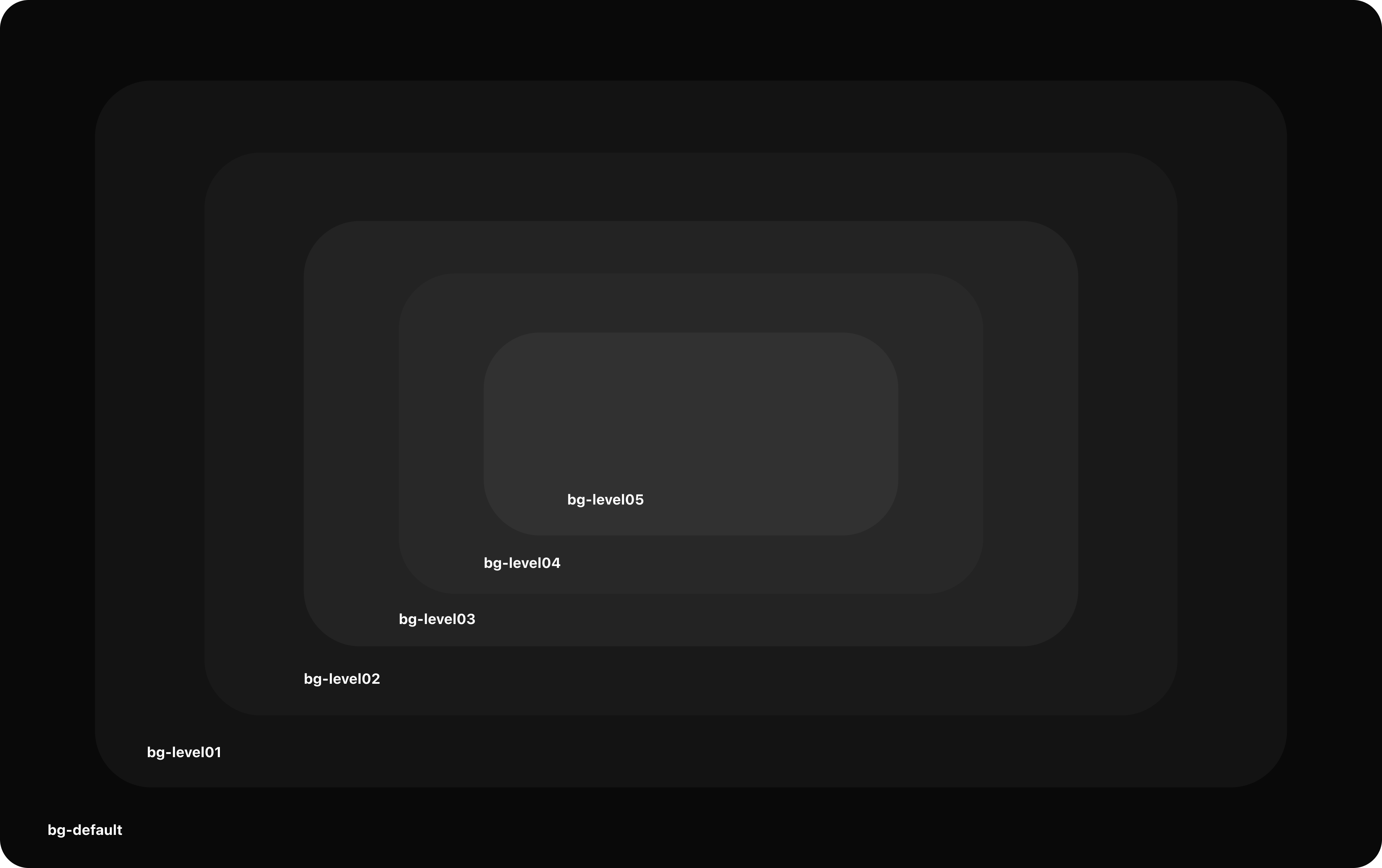
In <strong>dark mode</strong>, elevation is created primarily by layering
<code>bg.default</code> with <code>bg.level 01</code> through <code>bg.level 05</code> — each
step lifts a surface above the last. Use side navigation on <code>bg.default</code>; place the
main canvas on level 01; stack cards and panels on higher levels for hierarchy.
</p>
<p class="foundation-typography-meta" style="margin: 0">
In <strong>light mode</strong>, zeroheight documents additional shadow-based elevation
(<code>elevation.level 01</code>–<code>03</code>) for depth beyond flat fills. See zeroheight
for light-mode specs.
</p>
</div>
<div class="demo-panel" style="margin-top: var(--space-lg)">
<div class="demo-label">Background stack (dark)</div>
<p class="foundation-typography-meta" style="margin-bottom: var(--space-md)">
Nested surfaces from outer (lowest) to inner (highest). Padding uses <code>--space-md</code>.
</p>
<div style="background: var(--bg-default); padding: var(--space-md); border-radius: var(--radius-sm)">
<span style="font-size: var(--fs-caption); color: var(--text-subtle)">bg.default</span>
<div style="margin-top: var(--space-sm); background: var(--bg-level-01); padding: var(--space-md); border-radius: var(--radius-sm)">
<span style="font-size: var(--fs-caption); color: var(--text-subtle)">bg.level 01</span>
<div style="margin-top: var(--space-sm); background: var(--bg-level-02); padding: var(--space-md); border-radius: var(--radius-sm)">
<span style="font-size: var(--fs-caption); color: var(--text-subtle)">bg.level 02</span>
<div style="margin-top: var(--space-sm); background: var(--bg-level-03); padding: var(--space-md); border-radius: var(--radius-sm)">
<span style="font-size: var(--fs-caption); color: var(--text-subtle)">bg.level 03</span>
<div style="margin-top: var(--space-sm); background: var(--bg-level-04); padding: var(--space-md); border-radius: var(--radius-sm)">
<span style="font-size: var(--fs-caption); color: var(--text-subtle)">bg.level 04</span>
<div style="margin-top: var(--space-sm); background: var(--bg-level-05); padding: var(--space-md); border-radius: var(--radius-sm)">
<span style="font-size: var(--fs-caption); color: var(--text-subtle)">bg.level 05</span>
</div>
</div>
</div>
</div>
</div>
</div>
</div>
<div class="demo-panel" style="margin-top: var(--space-lg)">
<div class="demo-label">Alpha surfaces (subtle lift)</div>
<p class="foundation-typography-meta" style="margin-bottom: var(--space-md)">
Semi-transparent fills for inputs, cards, and hover states — see
<a class="text-link" href="/dashboard/design-system/foundation-color.html">Color</a>.
</p>
<div class="demo-row">
<div class="foundation-elev-demo" style="background: var(--alpha-bg-default)">--alpha-bg-default</div>
<div class="foundation-elev-demo" style="background: var(--alpha-bg-strong)">--alpha-bg-strong</div>
</div>
</div>
<div class="demo-panel" style="margin-top: var(--space-lg)">
<div class="demo-label">App chrome — shadows (WMG Chords)</div>
<p class="foundation-typography-meta" style="margin-bottom: var(--space-md)">
The dashboard shell uses additional shadow tokens for navigation affordances (not the full
elevation-level-01–03 set from the styleguide).
</p>
<div class="foundation-elev-demo" style="box-shadow: var(--sidebar-nav-item-shadow)">
<code style="font-size: var(--fs-caption); color: var(--text-subtle)">--sidebar-nav-item-shadow</code>
<p style="margin: var(--space-sm) 0 0; font-size: var(--fs-body-sm)">0 4px 12px rgba(0, 0, 0, 0.15)</p>
</div>
<div class="foundation-elev-demo" style="margin-top: var(--space-md); background: var(--sidebar-nav-active-gradient); box-shadow: var(--sidebar-nav-item-shadow)">
<span style="font-size: var(--fs-body-sm)">--sidebar-nav-active-gradient + shadow</span>
</div>
</div>React (TypeScript)
Use the same structure as the HTML block with className instead of class. Keep token/CSS imports in your app shell.
import type { ReactNode } from "react";

/** Mirror the HTML demo: replace class=> className, self-close void elements, keep WMG Chords global CSS loaded. */
export function FoundationElevationExample(): ReactNode {
  return (
    <>
      {/* TODO: paste JSX equivalent of the HTML tab */}
    </>
  );
}
Markdown (AI & docs)
Single bundle for Cursor, ChatGPT, or Confluence: rules plus a fenced HTML block you can extend.
# WMG Chords — Elevation

Use with AI tools or internal docs. Tokens: `/tokens/wmg-chords.css`; components: `dashboard/design-system.css`.

## HTML

```html
<div class="demo-panel">
              <div class="demo-label">Z-axis and dark mode</div>
              <p class="foundation-typography-meta" style="margin-bottom: var(--space-md)">
                In <strong>dark mode</strong>, elevation is created primarily by layering
                <code>bg.default</code> with <code>bg.level 01</code> through <code>bg.level 05</code> — each
                step lifts a surface above the last. Use side navigation on <code>bg.default</code>; place the
                main canvas on level 01; stack cards and panels on higher levels for hierarchy.
              </p>
              <p class="foundation-typography-meta" style="margin: 0">
                In <strong>light mode</strong>, zeroheight documents additional shadow-based elevation
                (<code>elevation.level 01</code>–<code>03</code>) for depth beyond flat fills. See zeroheight
                for light-mode specs.
              </p>
            </div>

            <div class="demo-panel" style="margin-top: var(--space-lg)">
              <div class="demo-label">Background stack (dark)</div>
              <p class="foundation-typography-meta" style="margin-bottom: var(--space-md)">
                Nested surfaces from outer (lowest) to inner (highest). Padding uses <code>--space-md</code>.
              </p>
              <div style="background: var(--bg-default); padding: var(--space-md); border-radius: var(--radius-sm)">
                <span style="font-size: var(--fs-caption); color: var(--text-subtle)">bg.default</span>
                <div style="margin-top: var(--space-sm); background: var(--bg-level-01); padding: var(--space-md); border-radius: var(--radius-sm)">
                  <span style="font-size: var(--fs-caption); color: var(--text-subtle)">bg.level 01</span>
                  <div style="margin-top: var(--space-sm); background: var(--bg-level-02); padding: var(--space-md); border-radius: var(--radius-sm)">
                    <span style="font-size: var(--fs-caption); color: var(--text-subtle)">bg.level 02</span>
                    <div style="margin-top: var(--space-sm); background: var(--bg-level-03); padding: var(--space-md); border-radius: var(--radius-sm)">
                      <span style="font-size: var(--fs-caption); color: var(--text-subtle)">bg.level 03</span>
                      <div style="margin-top: var(--space-sm); background: var(--bg-level-04); padding: var(--space-md); border-radius: var(--radius-sm)">
                        <span style="font-size: var(--fs-caption); color: var(--text-subtle)">bg.level 04</span>
                        <div style="margin-top: var(--space-sm); background: var(--bg-level-05); padding: var(--space-md); border-radius: var(--radius-sm)">
                          <span style="font-size: var(--fs-caption); color: var(--text-subtle)">bg.level 05</span>
                        </div>
                      </div>
                    </div>
                  </div>
                </div>
              </div>
            </div>

            <div class="demo-panel" style="margin-top: var(--space-lg)">
              <div class="demo-label">Alpha surfaces (subtle lift)</div>
              <p class="foundation-typography-meta" style="margin-bottom: var(--space-md)">
                Semi-transparent fills for inputs, cards, and hover states — see
                <a class="text-link" href="/dashboard/design-system/foundation-color.html">Color</a>.
              </p>
              <div class="demo-row">
                <div class="foundation-elev-demo" style="background: var(--alpha-bg-default)">--alpha-bg-default</div>
                <div class="foundation-elev-demo" style="background: var(--alpha-bg-strong)">--alpha-bg-strong</div>
              </div>
            </div>

            <div class="demo-panel" style="margin-top: var(--space-lg)">
              <div class="demo-label">App chrome — shadows (WMG Chords)</div>
              <p class="foundation-typography-meta" style="margin-bottom: var(--space-md)">
                The dashboard shell uses additional shadow tokens for navigation affordances (not the full
                elevation-level-01–03 set from the styleguide).
              </p>
              <div class="foundation-elev-demo" style="box-shadow: var(--sidebar-nav-item-shadow)">
                <code style="font-size: var(--fs-caption); color: var(--text-subtle)">--sidebar-nav-item-shadow</code>
                <p style="margin: var(--space-sm) 0 0; font-size: var(--fs-body-sm)">0 4px 12px rgba(0, 0, 0, 0.15)</p>
              </div>
              <div class="foundation-elev-demo" style="margin-top: var(--space-md); background: var(--sidebar-nav-active-gradient); box-shadow: var(--sidebar-nav-item-shadow)">
                <span style="font-size: var(--fs-body-sm)">--sidebar-nav-active-gradient + shadow</span>
              </div>
            </div>
```