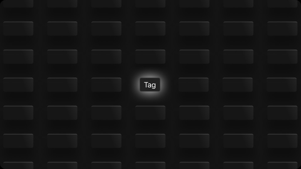
Tags are compact, non-interactive labels used to categorize, filter, or display metadata. They communicate status, type, or category at a glance and can include icons for added context.
Anatomy
A tag consists of a container with optional leading icon and required label text.
Container — Rounded pill with variant-specific background.
Leading icon — Optional small icon for visual context.
Label — Short descriptive text content.
Variants
Tags come in five semantic variants to support different use cases.
Primary — Default tag style with branded background.
Secondary — Outlined tag for less prominent categorization.
Static — Subtle emphasis-only fill, no border. Non-interactive style.
Active — Inverted high-contrast for selected/active state.
Info — Informational color for status or alert context.
States
Tags support default and disabled states. Hover states apply to interactive tags.
Default — Resting state with full contrast.
Hover — Slightly stronger background on pointer over.
Disabled — Muted fill with reduced text contrast.
Sizes
Tags are available in two sizes.
Large (lg) — Default size, body-sm font.
Small (sm) — Compact, caption font for dense UIs.
Primary
Code snippet
<Tag
  onClick={function f0e(){}}
  size="lg"
  variant="primary"
>
  Tag
</Tag>
With Icons
Tags can include a leading icon to reinforce meaning or add visual weight.
Icons should be small and contextual — avoid icons that compete with the label text.
Code snippet
<Tag
  onClick={function f0e(){}}
  size="lg"
  variant="primary"
>
  <Icon
    size="md"
    type="plus"
  />
  <span>
    Tag
  </span>
</Tag>
Guidelines
- Keep tag labels short (1-3 words). Tags communicate categories, not descriptions.
- Use a consistent variant within a group — don't mix Primary and Secondary in the same row unless indicating different states.
- Use the Info variant for system-generated metadata or temporary status indicators.
- Active variant should only be used when the tag represents a user-confirmed selection or toggle state.
- Disabled tags should be avoided when possible — prefer hiding unavailable tags entirely.
Dos and Don'ts
Use tags to categorize items with short, scannable labels.
Don't use long sentences or full descriptions inside tags.