Overview
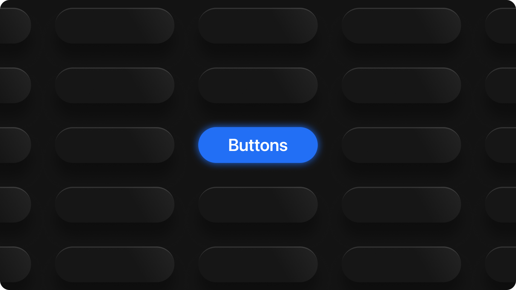
Buttons are interactive elements that users can select to trigger an action or navigate to another part of the application. They're essential for enabling user interactions and guiding users through various functions.
Usage
Button
Buttons carry a single action—lead with a verb. Use primary for the main step, secondary for alternatives, and tertiary or text link for lower-emphasis actions. Pair primary with secondary in flows (e.g. Cancel / Save); align the primary action to the trailing end.
Code
Copy snippets into your app. Import /tokens/wmg-chords.css and the stylesheet that defines .btn (see this repo’s dashboard/design-system.css or your product bundle). Font Awesome 6 is used for icon demos.
HTML
Semantic <button type="button"> with WMG Chords classes. Match variant (btn-primary, etc.) and size (btn-md, …).
<!-- WMG Chords — import /tokens/wmg-chords.css and styles that define .btn -->

<button type="button" class="btn btn-md btn-primary">Primary</button>
<button type="button" class="btn btn-md btn-secondary">Secondary</button>
<button type="button" class="btn btn-md btn-tertiary">Tertiary</button>
<button type="button" class="text-link">Text link</button>
<button type="button" class="btn btn-md btn-primary" disabled>Disabled</button>

<!-- Sizes (primary) -->
<button type="button" class="btn btn-sm btn-primary">Small</button>
<button type="button" class="btn btn-md btn-primary">Medium</button>
<button type="button" class="btn btn-lg btn-primary">Large</button>
<button type="button" class="btn btn-xl btn-primary">XLarge</button>

<!-- With icon (Font Awesome 6 class names) -->
<button type="button" class="btn btn-md btn-primary">
  <i class="fa-solid fa-download" aria-hidden="true"></i> Export
</button>

<!-- Icon-only: always set aria-label -->
<button type="button" class="btn btn-md btn-tertiary btn-icon-only" aria-label="More options">
  <i class="fa-solid fa-ellipsis" aria-hidden="true"></i>
</button>

<!-- Paired actions: primary on the trailing end -->
<div style="display:flex;justify-content:flex-end;gap:var(--space-md)">
  <button type="button" class="btn btn-md btn-secondary">Cancel</button>
  <button type="button" class="btn btn-md btn-primary">Save</button>
</div>
React (TypeScript)
Same class strings as HTML; use className. Wrap or import into your design-system layer as needed.
import type { ButtonHTMLAttributes } from "react";

type Variant = "primary" | "secondary" | "tertiary";
type Size = "sm" | "md" | "lg" | "xl";

function btnClasses(variant: Variant, size: Size = "md"): string {
  return ["btn", "btn-" + size, "btn-" + variant].join(" ");
}

/** Same class strings as static HTML — load global CSS that defines .btn (WMG Chords). */
export function ChordsButton({
  variant = "primary",
  size = "md",
  className = "",
  children,
  ...rest
}: ButtonHTMLAttributes<HTMLButtonElement> & {
  variant?: Variant;
  size?: Size;
}) {
  return (
    <button
      type="button"
      className={[btnClasses(variant, size), className].filter(Boolean).join(" ")}
      {...rest}
    >
      {children}
    </button>
  );
}

/** Lowest-emphasis action (not a .btn surface). */
export function TextLinkAction(props: ButtonHTMLAttributes<HTMLButtonElement>) {
  return <button type="button" className="text-link" {...props} />;
}

export function CancelSaveFooter() {
  return (
    <div
      style={{
        display: "flex",
        justifyContent: "flex-end",
        gap: "var(--space-md)",
      }}
    >
      <button type="button" className="btn btn-md btn-secondary">
        Cancel
      </button>
      <button type="button" className="btn btn-md btn-primary">
        Save
      </button>
    </div>
  );
}
Markdown (AI & docs)
Single file you can paste into Cursor, ChatGPT, or Confluence. Includes rules plus fenced HTML and JSX examples.
# WMG Chords — Button

Use this block with AI tools (Cursor, ChatGPT, etc.) or paste into internal docs. Classes match `/tokens/wmg-chords.css` + app styles that define `.btn`.

## Rules
- **Primary**: one main action per region; place on the **trailing** end next to Cancel in pairs.
- **Variants**: `btn-primary`, `btn-secondary`, `btn-tertiary`, or `text-link` for lowest emphasis.
- **Sizes**: `btn-sm` | `btn-md` | `btn-lg` | `btn-xl` (always paired with a variant class).
- **Icons**: Font Awesome 6 (`fa-solid …`); icon-only buttons need `btn-icon-only` + `aria-label`.

## HTML

```html
<button type="button" class="btn btn-md btn-primary">Save</button>
<button type="button" class="btn btn-md btn-secondary">Cancel</button>
```

## React (JSX)

```tsx
<button type="button" className="btn btn-md btn-primary">
  Save
</button>
```

## Pairing

```html
<div style="display:flex;justify-content:flex-end;gap:var(--space-md)">
  <button type="button" class="btn btn-md btn-secondary">Cancel</button>
  <button type="button" class="btn btn-md btn-primary">Save</button>
</div>
```