
The breadcrumb component is a navigational aid, clearly indicating a user's current location within the product. It shows site hierarchy to the current page—helping users understand where they are and providing an easy way to go to a parent page.
Content
- Each segment of the breadcrumb should be a short, clear, and descriptive label. Avoid unnecessary words.
- Labels should match the corresponding page titles (or a concise version of them) for consistency.
- Always begin the path from the logical top-level entry point (e.g., "Dashboard," "Home," "All Accounts").
- Don't include filters, sort options, modal titles, or temporary states within the breadcrumb path. These aren't part of the navigational hierarchy.
- Use dynamic labels for items like specific records (e.g., a project name, artist name).
Anatomy
A breadcrumb trail is built from three elements: links, separators, and a current page label.
Links use the caption/semibold style (12 px, weight 590) with an underline. They navigate to ancestor pages.
Separators are chevron-right icons in text-subtle colour, spaced 8 px apart from items.
Current page uses the caption/regular style (12 px, weight 400) with no underline. It is not interactive.
Default
The standard breadcrumb shows the full hierarchy path. Ancestor levels are underlined links; the current page is plain text.
Separators use a chevron-right icon from Font Awesome, coloured text-subtle.
Truncated
When the path exceeds a maximum width or number of items (e.g., 5–7 items, or on mobile), truncate intermediate levels.
Indicator: Replace truncated items with an ellipsis (…)
Interaction: On hover, a tooltip can show the full hidden path. When selected, it can navigate to the closest parent of the truncated section.
Individual breadcrumb items that are longer than 30 characters (including spaces) should trigger truncation.
Placement
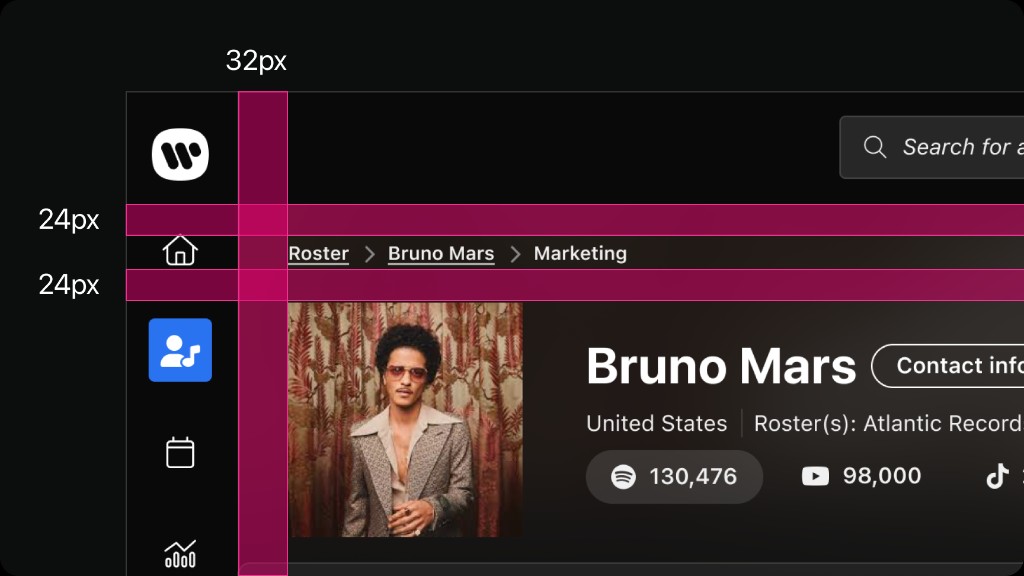
- Place at the top of the main content area of a page.
- Place above main content heading and below main navigation elements (like global search).
Dos and don'ts
Use chevron-right icons as separators between breadcrumb levels for clear visual hierarchy.
Don't use slashes, arrows, or other characters as separators. Stick to the chevron icon for consistency.
Make the current page the last item in the trail, displayed as plain text (not a link) with aria-current="page".
Don't make the current page a clickable link. It creates a confusing loop where clicking reloads the same page.
Use for deep hierarchical structure (typically three or more levels).
Don't use for linear, step-by-step processes.
On detail pages accessed from a list or overview.
Don't use in shallow hierarchies (one to two levels) where global navigation or a page title is sufficient.